
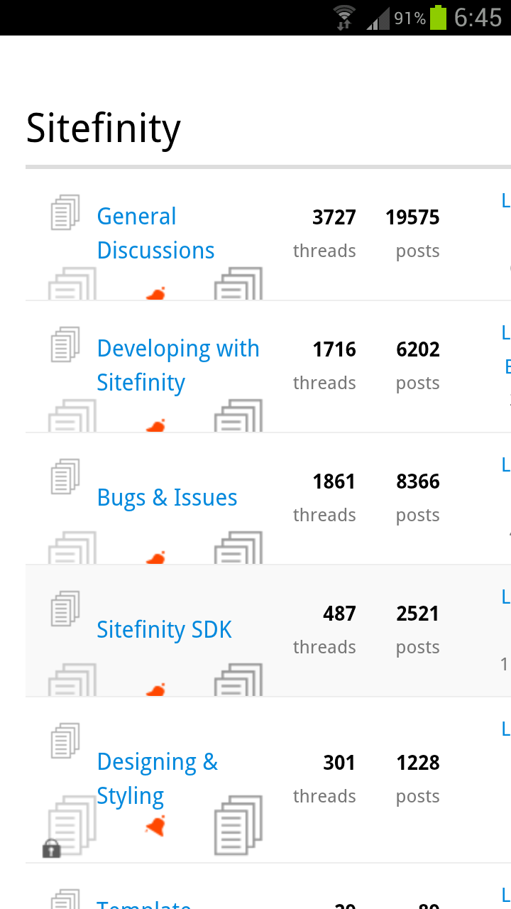
Responsive Design makes forums on sitefinity.com unusable
I was just warming up to responsive design, but I think this forum has a very bad implementation. Well it looks nice if the divs get rearanged, but to me as soon as I go smaller then 1000 pixel I am no longer able to log in - so I CANNOT use the forum on my tablet portrait mode for example (and I was told this is what many people use @J :-))
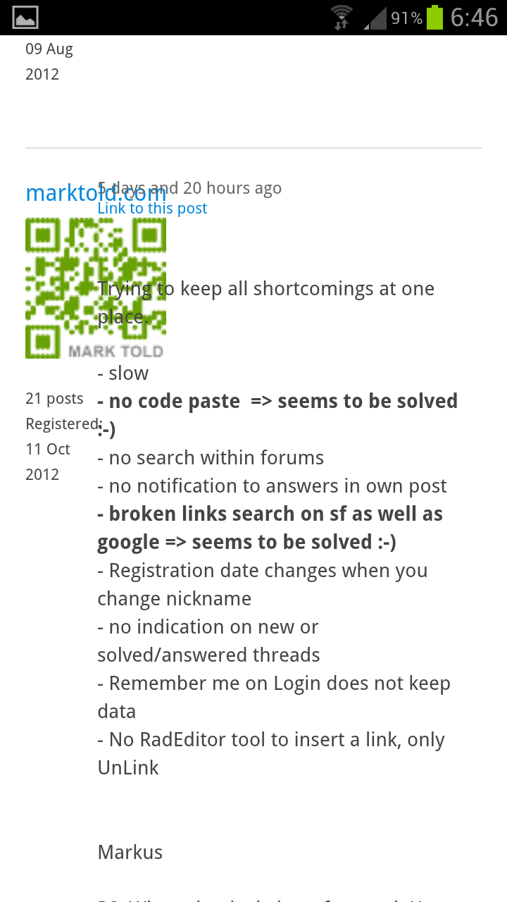
Here is a screencast www.marktold.com/screencast/sf_responsive_forum.swf
And on my Samsung Galaxy S3 portrait mode you you can not scroll sideways so some information, last poster is in acceassable.
Usually I don't like it if sites on my smartphone get rearanged and I cannot see them as on my desktop, but taking away functionality should not happening in my opinion.
Markus

Try removing the maximum-scale=1.0 from
<meta name="viewport" content="width=device-width, initial-scale=1.0, maximum-scale=1.0">
That should take care of the non ability to scroll horizontally.
Jochem
In tp.css around line 321 you hide the #sitenav for anything screen smaller than 980px.
@media screen and (max-width: 980px)
#sitenav display: none
...
No sense in trying to override it in devnet.css since tp.css gets loaded afterwards.
At least change it to so it will still be visible up till 768px wide. That way we'll at least be able to answer support tickets or view our accounts on a tablet.
As for workaround:
@media screen and (max-width: 768px)
#sitenav position: relative;
#sitenav-main display: none;
#toggle-link display:none;
#sitenav-personal-info-menu float:left;
Jochem