
UI use the available space
I would expect that a users needs at least 1024 pixel screen resolution to work with SF.
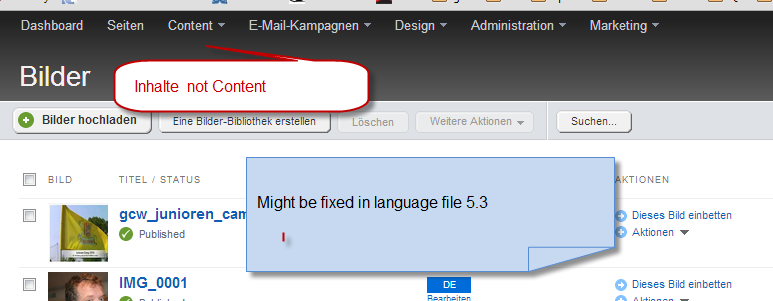
See the screenshot. Some languages take more letters/space on buttons. So why not make the design a bit wider. Instead of 650 pixel why not go at least for 800 pixels.
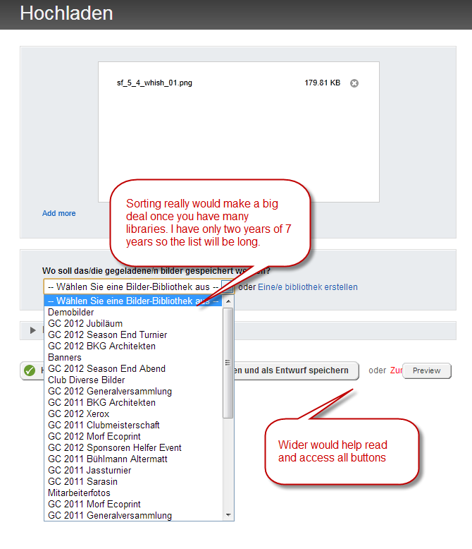
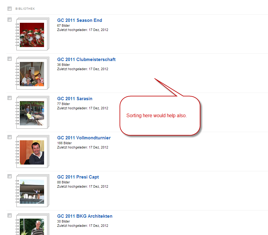
This would also help if you had longer library names that they would not break and make it more readable. Especially since they are not yet sorted in 5.2.
Markus
I'd +1 this for wider screen monitors at least...less scrolling that'd need to happen for long models
I'd +1 as well for a min-width:650px; and a width:50% to accomodate those who actually don't do everything on an iPad but actually use their +1280px tft monitor...
Hello,
Moving the thread to the UX section.
Kind regards,I guess it was to late to fix these problems in 5.3 - Please, please adress them in 5.4
5.3 brought more new stuff then expected so I hope 5.4 will be the long expected 1000 small things fixed/improved release.
Markus
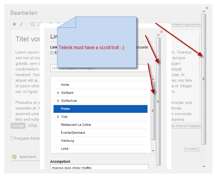
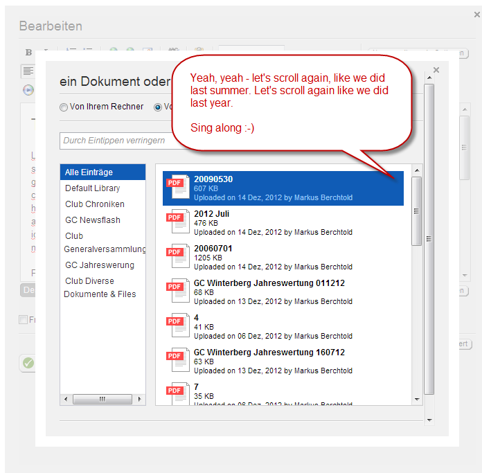
Any news from the UI team if the needless endless scrolling double scrolling has finaly come to the end of its life span?
It cant be to hard to make most of the UI stuff just 30 pixel heigher. That would probably take away 50% of the scrollbars.
Markus
PS: One thing users and telerik have in common. We all hope that this is fixed very soon :-)
Hi Markus,
Thank you for getting back to us.
What I am happy to share is that most of the issues you described are already fixed and will go live with our next release.
For example - scrollbars should appear only when needed and the libraries will be sorted alphabetically by default.
Stay tuned for more details and improvements.
Kind Regards,
Antoaneta
the Telerik team
Dear Antoaneta
If you guys work in this www.sitefinity.com/.../5-4-begging-you-for-some-ui-improvments then x-mas really comes early :-)
Looking so much forward to 5.4
Markus
Hi Markus,
We have tried our best to fix all issues related to Image widget but some of the fixes are not included in the upcoming release.
Librarires are now alphabetically ordered but still if you have longer titles they will look like the ones from your screenshot.
We will continue improving the Image widget so your feedback will be taken in mind.
All the best,
Dear Antoaneta
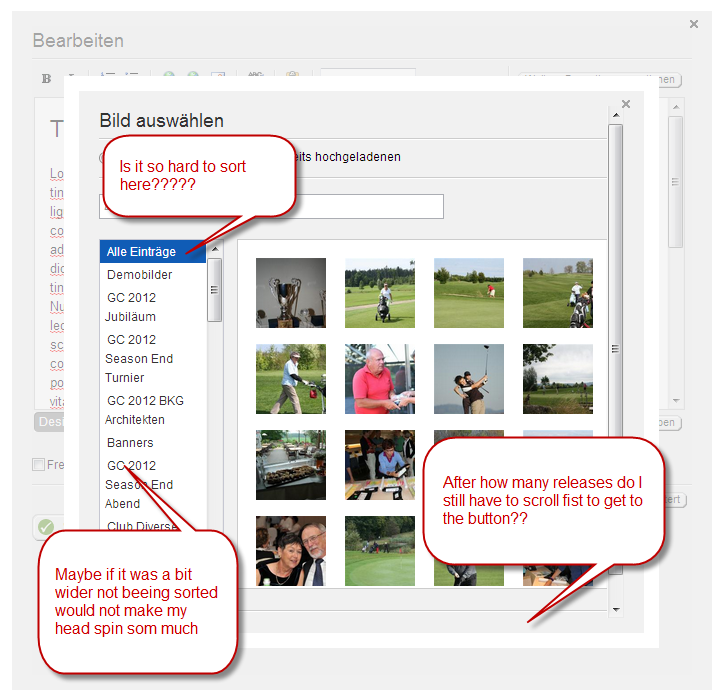
The sorting already helps a lot. But if you look at the attached screenshot because you do not use the available space its still a pain to work with it.
Assuming that you need a computer with at least 1024 px resolution it could easely be made wider. I would even love to get it a bit higher to to loose the last scrollbar.
Not so much a problem if you have 3-5 libraries but once you have 50+ it rellay makes a difference.
Hope you are considering this really and implement this in 5.5 (or 6.0) if this is the next version.
Markus