
What's best way for alternate style rules for PageEdit?
Hi all,
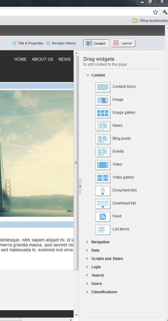
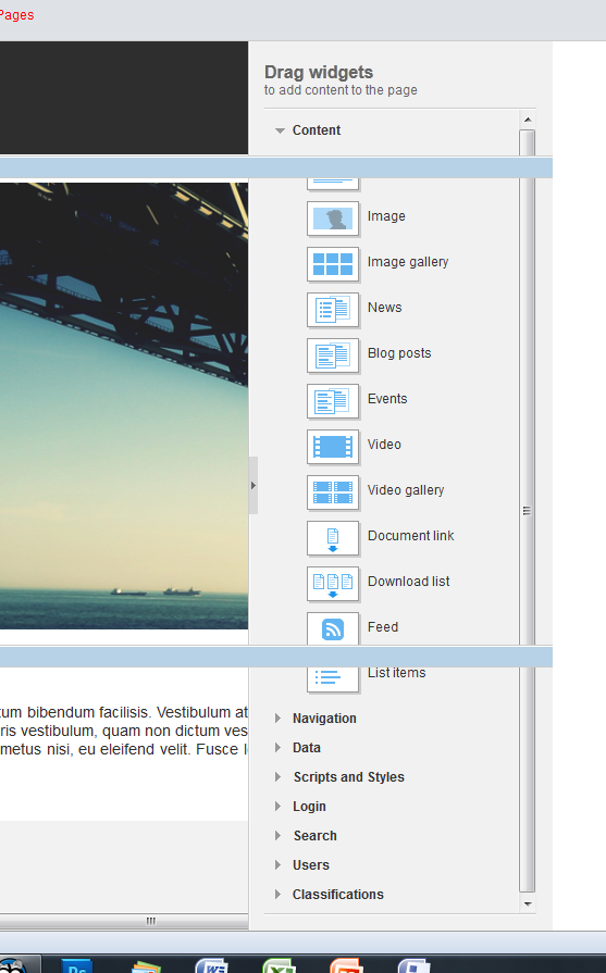
I'm working on a design that has the body set to width:100% and a wrapper inside of that, that has a min-width of 1540px which gets triggered by the screen-size). Because the wrapper is that wide, the content gets hidden behind the widget bar and all the actions (edit/more) for full-width elements are hidden behind the it. So for each content item a user wants to edit, they have to scroll to the right to be able to click on the edit button.
I don't mind removing the min-width 1540px when editing a page so everything will tuck neatly inside the fixed width .
However the only way I can seem to do that is through the body tag.
When in page(or template) edit a class gets added to the body tag called 'sfPageEditor'. But if I start messing with the width of the body tag, we all know what's gonna happen... (if not open firebug, override your body tag and give it width:960px :) )
So, the only way I can come up with is to use an inline script to check for IsDesignMode or to check the class on the body tag and if so, add an extra inline style that'll override my wrapper width.
I know I am picky and a blonde perfectionist but an inline style on top of an inline script is to me messy.
There has to be a better/easier/cleaner way to do this no?
Jochem.
Hmmm, You couldn't run a script in the designer anyway
Why can't you just have the 1540px wrappers be 960px in page edit mode?
As Steve mentioned, a solution like
.sfPageEditor .sfWrapper width:960px;Hi Jochem,
This is very interesting case indeed!
The solution provided by Steve is the first that came on my mind, but if this doesn't work you can try with media queries:
@media screen and (max-width: 1541px) #wrapper width:940px; @media all and (max-width: 1200px) #wrapper min-width: 1540px; width: 100%; Hey Jordan,
(I'd love a discussion here, but since this is technically not a Sitefinity styling problem, feel free to take it outside and use email which we've already exchanged earlier this week)
Like I said to Steve in an email as well, there is unfortunately a difference between things that SHOULD and things that ARE happening when you're using media queries.
From my experience as soon as you're using .class .class or .class #id statements in media queries you can expect strange and not cross-browser behavior, especially with Opera and FF v3. Vendor prefixes in a media query are also a guarantee to get your customers on the phone often.
---
Try using ctrl + / ctrl - in different browsers on a responsive page. Where Firefox will ultimately kick in a max-width:320px, Chrome won't. Internet Explorer 9 will but (and I quote @TommyLee, a Microsoft IE evangelist) 'It will not trigger a media query in IE10' in a directly asked question.
---
In this case a mediaquery kicks in setting the wrapper to a min-width of 1540px. Since my screen is 1680px wide, naturally scrollbars appear. (see screenshot mq_chrome.png). So technically everything works 100% as it should, but it's a major nusance...
As Steve pointed out, you'd expect .sfPageEditor .sfWrapper width:960px; to work,and it does in 80%-90% of the cases, but I've managed to snapshot one of the cases where it didn't (see mq-firefox.png).
Alternative could be to keep media queries out of the theme and into a seperate linked stylesheet and load that conditionally or something like that... need some time to figure out something bulletproof.
Jochem.
Hi Jochem,
Thank you for the screenshots. I have tested the scenario with setting a width to the elements with .sfPageEditor. On the screenshot that you have sent the problem comes from the with of the .sfPageEditor .sfPageWrapper. Since this is the holder of the entire page it shouldn't be in use. Your own selector should be used instead:
For example:
body.sfPageEditor #wrapper width: 900px;The #wrapper can be placed inside your master page as a root element or if you don't want to use master pages you can set CSS class to the root layout element - .wrapper (in this case use .sfPageEditor .wrapper)
Hey Jordan,
Thanks for taking the trouble to dive into it. I double checked whether I've used the right classes and see what you mean. Addressing the .sfPageWrapper gives indeed somewhat similar distorted behavior. (I'll stop using the name sfWrapper to avoid confusion in samples next time) but not entirely the same.
For now I've moved on with some other aspects of the site and just kept the min-width out, but I can keep you in the loop if you're interested when I'm going to have a go at it next week...
Jochem.
Hello Jochem,
At any time when you can provide us an access to some dev instance of the website we can check the things directly there.