
Styling Responsive Design
Hi
I have 2 questions regarding styling of the Responsive design - hope someone can help !
#1 - When I apply a specific css to a responsive rule, the css I apply is correctly overruling the standard css file, BUT on all screen sizes. Why, am i missing something, ore what could I have done wrong - any suggestions??
#2 - Second question is a matter of how to. In large screenes i want the navigation to be horizontal one level, but when seen on a smaller screen I want the navigation to transform into a toggle menu with sub-menu's - doe's anyone have a solution for this scenario????
I have tried with 2 navigations in the same template, one showing on large screen's and one showing on smaller screen's but it doesn't work, and doesn't seem like the right solution anyway??
Hope someone have some good ideas :-)
Best regards
Christian
Hey Christian,
Regarding #1:
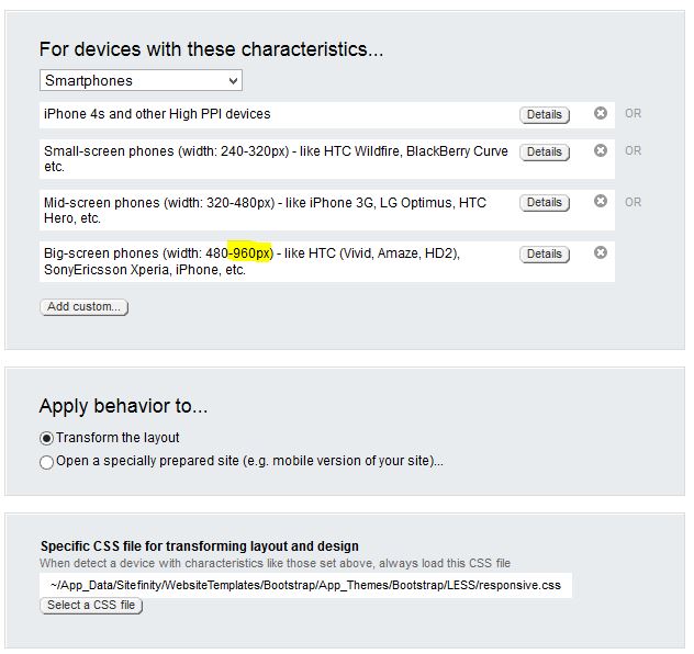
You've either setup your rules incorrectly - keep in mind when using 'smartphones' from the dropdown, it will apply up to 960px because of the 'big-screen phones'. (see screenshot).
Or perhaps you're pointing to a 'responsive.css' which is in the /global folder of your theme? Sitefinity loads all css files in /global by default, moving it to the /styles folder would resolve it in that case.
But ideally you should see something like this on your page source:
1.<link href="/website/Site...me/global/project.min.css?v=635" type="text/css" rel="stylesheet" />2.<link href="../responsive.css" type="text/css" rel="stylesheet"3. media="only screen and (min-device-pixel-ratio : 1.5)" />4.<link href="../responsive.css" type="text/css" rel="stylesheet"5. media="only screen and (min-width: 240px) and (max-width: 320px)" />6.<link href="../responsive.css" type="text/css" rel="stylesheet"7. media="only screen and (min-width: 320px) and (max-width: 480px)" />
Regarding your 2nd question, you've got several possibilities:
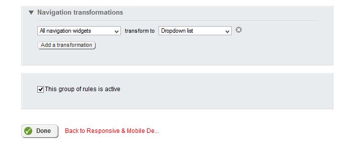
First the responsive design works with the new navigation widget, which can do exactly what you described. In responsive design, there's a "navigation transformations" option where you can select it to transform into a dropdown.
Or, you could set the page to go to a specially prepared site which has everything setup for mobile.
Naturally, that's not ideal if you're aiming for responsive instead of mobile but depending on further content changes it could be an option.
Jochem