
Is it possible ti left-align labels as default in Rollbase UI?
Yes indeed it is possible :)
First let me say that in V4.2, you will have the option to align the labels on top of the value field. In order to support that we had to change the structure of the label and value pair so what I am going to describe will be in 2 parts: pre- V4.2 and V4.2 and greater.
By default, we have a CSS rule that specifies the alignment, the rule is:
.rbs-simpleField-labelContainer {
text-align: end;
}
That rule ensures that the label is right aligned when text direction is left-to-right and aligned left when text direction is right-to-left.
In both cases, you will need to override a CSS rule to specify the alignment as start (put it in custom header or custom sidebar). Here, are the rules:
For version less than V4.2:
.rbs-simpleField-labelContainer {
text-align: start;
}
For version >= V4.2
.rbs-simpleField-labelContainer-1line {
text-align: start;
}
This and the full structure of the label/value pair should be documented in the online doc with a diagram (I remember creating the diagram). Will try to dig where in the doc that is.
Thierry.
Below are some rough graphic (drawn by hand) representing the fields structure in both object view and object edit. It may look a bit complicated but it's really not that bad in reality. There simply are containers in the right place to let you tailor any part of the rendering via CSS.
And by the way, there is also a container for the separator between label and fields; so for example, you can add : as a separator if you like.
We will update the doc with more in depth description as it looks like it didn't make it last time.
Does this help?
Thierry.
With simple CSS rules, responsive to various device width, we can tailor how the width of a field is allocated to the labels, separator and value.
When editing, the value is further split into how much the actual edit control uses out of the space available for the value.
The overall field width is allocated by the section generator based on the number of columns and the responsive rules.
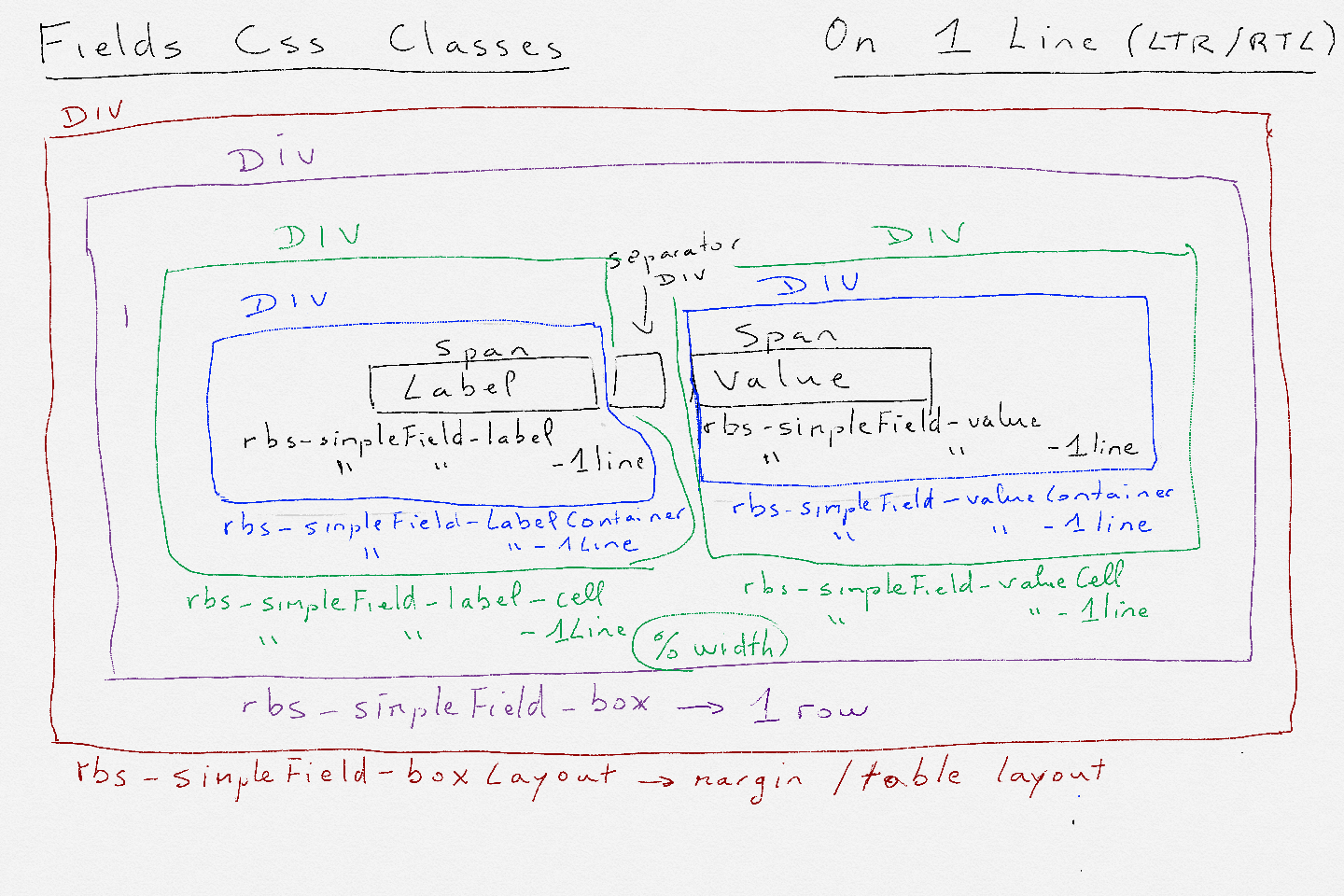
Here are more details on the structure of simple fields (as opposed to complex fields like calendar control that takes the whole canvas).
Here is the structure used when fields are rendered on 1 line that is label on left and value on right in LTR and label on right and value on left in RTL.
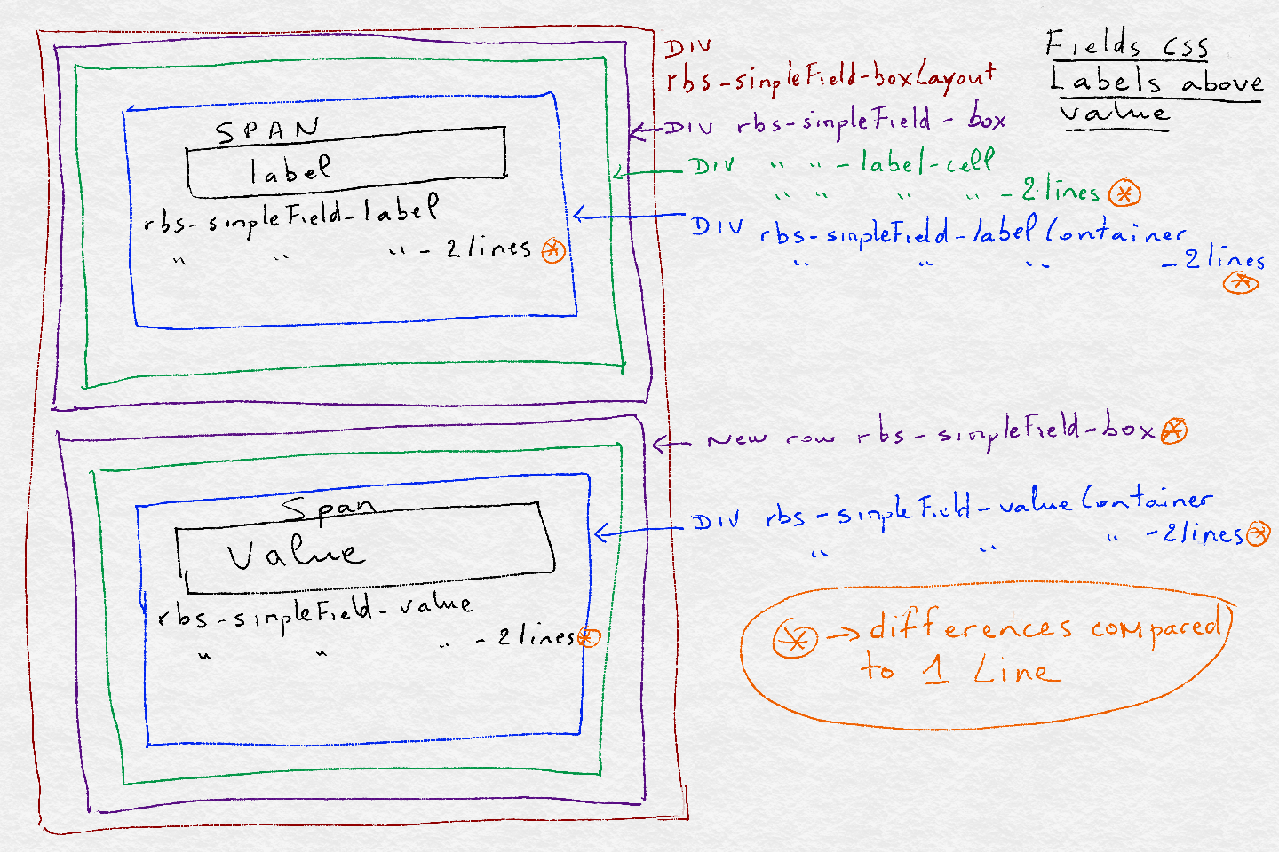
Fields can also be rendered with labels above value. It is very similar to 1 line but we have two rbs-simpleField-box to ensure 2 lines. The diagram below depicts the structure and css classes used. Also the differences with 1 line are highlighted in orange:
Yes indeed it is possible :)
First let me say that in V4.2, you will have the option to align the labels on top of the value field. In order to support that we had to change the structure of the label and value pair so what I am going to describe will be in 2 parts: pre- V4.2 and V4.2 and greater.
By default, we have a CSS rule that specifies the alignment, the rule is:
.rbs-simpleField-labelContainer {
text-align: end;
}
That rule ensures that the label is right aligned when text direction is left-to-right and aligned left when text direction is right-to-left.
In both cases, you will need to override a CSS rule to specify the alignment as start (put it in custom header or custom sidebar). Here, are the rules:
For version less than V4.2:
.rbs-simpleField-labelContainer {
text-align: start;
}
For version >= V4.2
.rbs-simpleField-labelContainer-1line {
text-align: start;
}
This and the full structure of the label/value pair should be documented in the online doc with a diagram (I remember creating the diagram). Will try to dig where in the doc that is.
Thierry.
Below are some rough graphic (drawn by hand) representing the fields structure in both object view and object edit. It may look a bit complicated but it's really not that bad in reality. There simply are containers in the right place to let you tailor any part of the rendering via CSS.
And by the way, there is also a container for the separator between label and fields; so for example, you can add : as a separator if you like.
We will update the doc with more in depth description as it looks like it didn't make it last time.
Does this help?
Thierry.
With simple CSS rules, responsive to various device width, we can tailor how the width of a field is allocated to the labels, separator and value.
When editing, the value is further split into how much the actual edit control uses out of the space available for the value.
The overall field width is allocated by the section generator based on the number of columns and the responsive rules.
Here are more details on the structure of simple fields (as opposed to complex fields like calendar control that takes the whole canvas).
Here is the structure used when fields are rendered on 1 line that is label on left and value on right in LTR and label on right and value on left in RTL.
Fields can also be rendered with labels above value. It is very similar to 1 line but we have two rbs-simpleField-box to ensure 2 lines. The diagram below depicts the structure and css classes used. Also the differences with 1 line are highlighted in orange: