Do not be deceived by the version number, this latest release is packed with lots of enhancements [:D]
At a high level, here is what is available in the new UI:
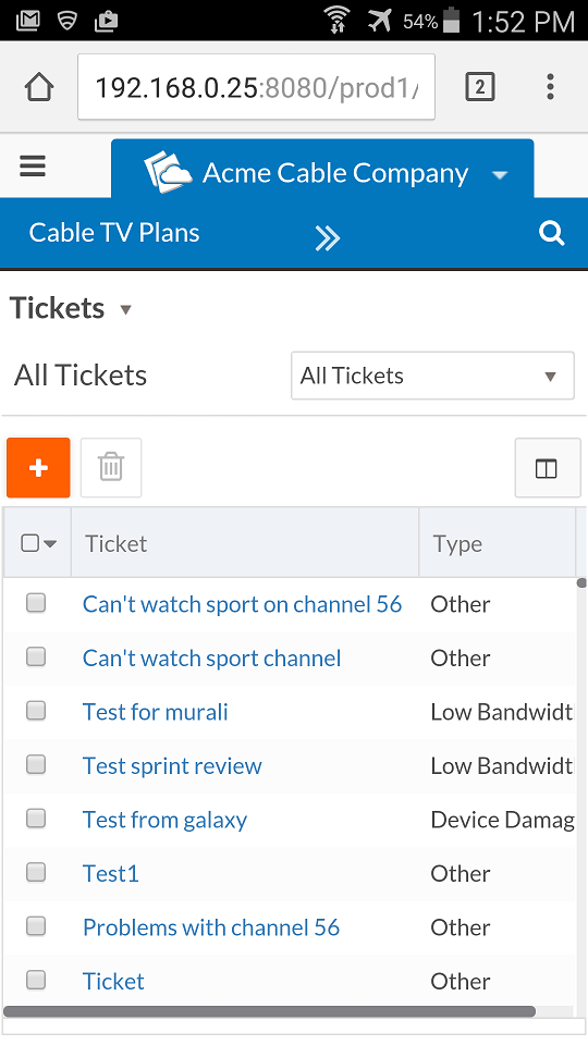
Within the coming days, I will write up more details on all these features. For now I'll leave it to an example with screenshots of 2 different devices:
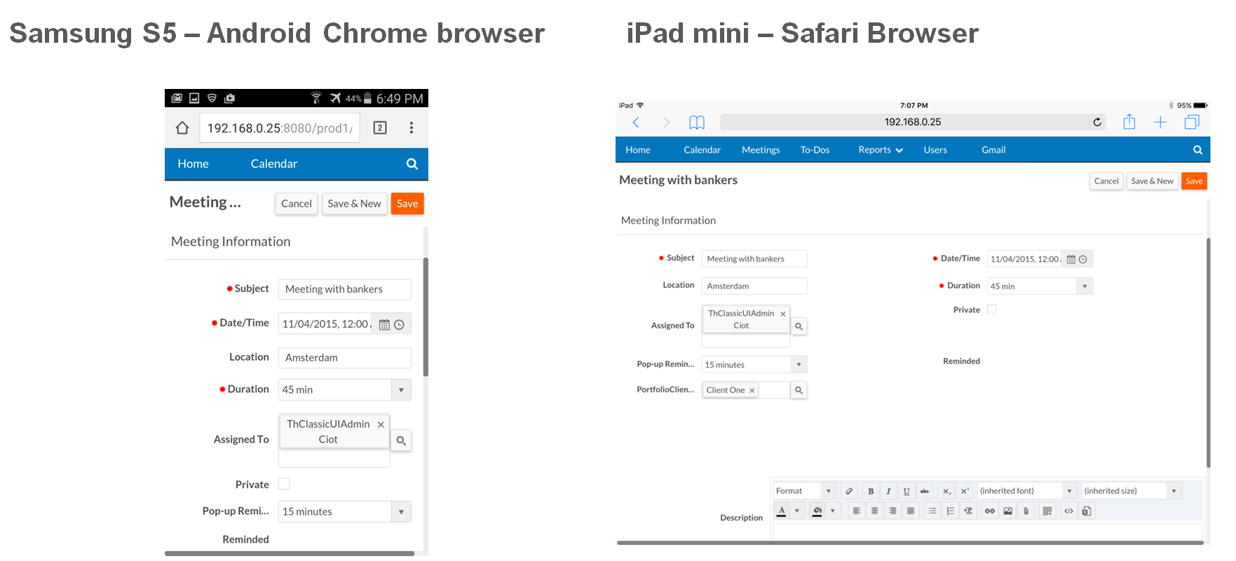
You will see that the New UI on tablets and smart phones is targeted at end users, by that I mean it does not have setup and admin functions.
We know we still have some ways to go to provide first class support on mobile devices and this release is a step towards that goal. We hope you will enjoy the improvements.
Thierry.
Today, we want to share what we have done to improve support for Grid Height.
The grid height can now be specified as a percentage of the viewport as well as using the rem unit (until V4.0.2 we have support for px and em).
For example, by specifying 100% in page designer for list view object, the grid will automatically be sized to fit in the available space in the browser window.
This is particularly useful:
Also, in combination with infinite scrolling, we have received feedback from various customers that it does provide a very natural experience on mobile devices.[Y]
Here are a couple of screenshots from a tablet in portrait and then rotated to landscape. The grid is set to use 100% height and to use infinite scrolling.


Below you will find all the details on the various units and how we now support them.
Hope you will find this useful too.
Happy rapid coding
Thierry.
In page designer, application designer can specify grid height as either:
Also, styles like margin and padding from rb-styleable-content-box (the overall container/sometime called canvas) are taken into account to size grid properly. For example, if rb-styleable-content-box as a 20px bottom margin, 20px of empty space will show at the bottom (for a grid set at 100% height and assuming the grid is the only section on the page.
Note: One can set grid at 100% and still add other sections to the page. The sizing in that case works exactly the same as described above.
empty or -1:
If infinite scrolling is set:we will set the grid height to rb.newui.options.listView.minHeightForInfiniteScrolling (default to 330px).
If infinite scrolling is not set: no height is computed and the grid shows all available rows (based on page size) - this is the compatible mode with classic ui.
If not unit is specified, we default to pixel.
And for completeness here is a screenshot from a smart phone of the same application and the same list view: