
Hello fellow RB programmers.
In the new 4.0 release, the new ui leverages Bootstrap V3 for its responsiveness. However, you don't need to learn anything about Bootstrap to start designing pages that will automatically be responsive.
Simply go in the page designer, create pages with multiple columns and you have a responsive page.
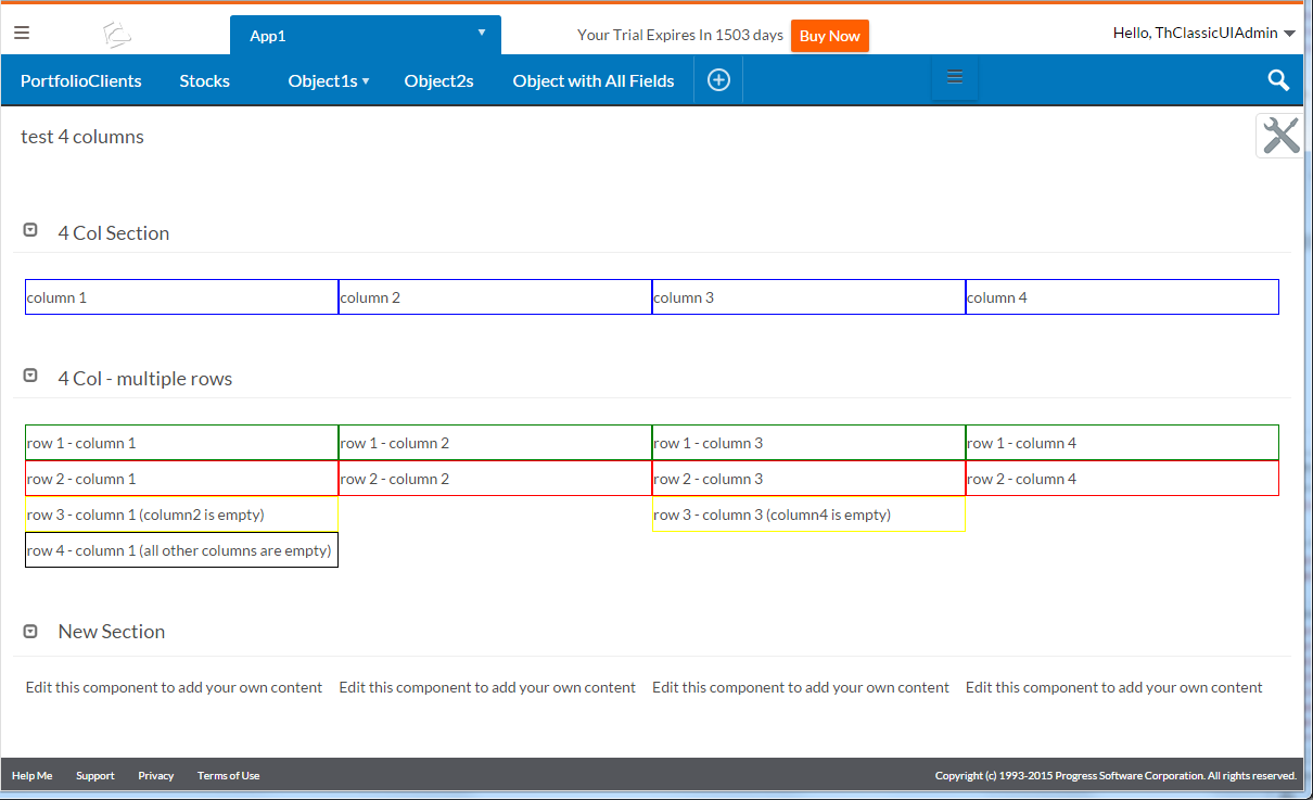
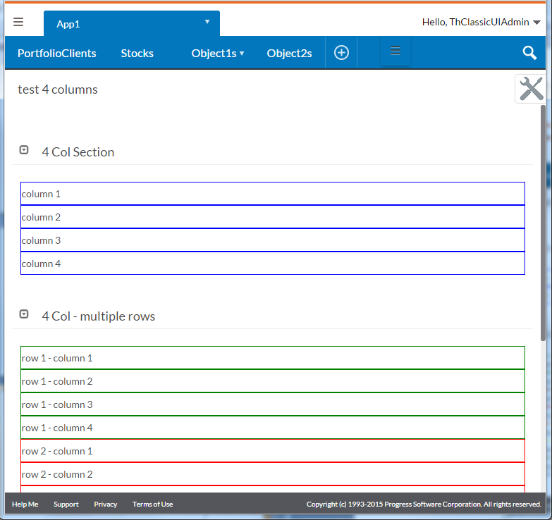
Version 4.0, now supports up to 4 columns. The 4 columns are displayed on large screens, for medium size screen your page will automatically switch to 2 columns and on small size it will switch to single column as illustrated in these screenshots:

Thierry.
And here is a sample app demoing these concepts as an attachment.