
Hello All,
Yesterday we installed Rollbase 4.0 and ran some tests on this new version. I have to say the looks are great and i think it's certainly an improvement.
But i also have some remarks:
The new look and feel seems to be developed for mobile as primarily usage. So i wonder if this new look and feel also is an improvement for desktop users? A lot of actions can only be performed after clicking twice. Actions that used to be buttons on the screen are now in a menu, and are always at the edge off the screen, that's not where your mouse is.
The lookup is changed nicely but the lookup in the grid is still terrible, only another look but no different behavior, it even still uses the old selector list object(bah). Also the linked lookup is still not working in here.
Why this topic?
Our expectations where very high for this release and it almost seems like a magical version that should solve all our problems. But now, i don't know my feelings are mixed about it and i'm sure my desktop end users will agree that it is not a functional improvement for them, and also i see that a lot of our wishes about functionality are not(see idea list) are still not full filled. So i wonder what the feelings are from other Rollbase developers.
Regards,
Wilco Weultjes.
HI,
I have not yet had time to get a closer look at this but the points you mention here, are very important.
The action buttons is a must, with a one-click solution.
And I really hope that the lookup is changed or can be changed, also in a grid.
We can't switch the UI before this isfixed.
We are actively looking at developer feedback and will be acting them upon them in service packs to 4.0 in near future
What kind of feedback do you expect and in what form can we contribute? Are you going to create a special topic for 4.0 feedback? Seems convenient to me to group / centralise the feedback.
Hi,
Thanks for the feedback for the menu actions. In the past, we have received a fair amount of feedback that the ui was “overloaded and needed simplification”; we may have been a bit too aggressive in putting some of the buttons automatically in the overflow menu (it has the advantage of making the ui looks cleaner and simpler which is what some people were asking for and it’s hard to please everybody and find the right balance). We can certainly adjust these easily.
Would you have a priority list of which buttons you would want to see in an overflow menu all the time versus in the visible part of the toolbar? ( Of course the toolbar is now responsive, so if there is not enough space in the toolbar the buttons will automatically move to the overflow menu - so really the question is about which buttons/actions should be forced in the overflow to make the ui looks cleaner vs the buttons that will either be in the visible part or in the drop down depending on available space).
In terms of “end users will agree that it is not a functional improvement for them”, we have added a lot of functionality in various places. For example, in the list view, now an end user can rearrange columns, resize them, hide and show them. These settings are all preserved on a per user per view basis. We have received a fair amount of positive feedback for this. Additionally, you can now size the grid (in page designer) to the exact height you want it to be rendered on the page, independently of the paging parameter. Again, we have received positive feedback for this as they couldn't design their page to the exact pixels height they wanted)
We also hope you will like the capabilities:
Thierry.
Yes agreed. Rather than a single topic we will start using tags and see how that goes.
Please, use the following
You can use the same logic as in the old UI, to find out which Workflow-actions to to force to the owerflow menu.
WF-actions with the "Render button rather than link for this action should NOT be forced to the owerflow-menu.
It is very important that this is put in place for wf-actions as soon as possible.
I agree with smartsysISV: the workflow actions with the "Render button.." setting should be displayed on the page. We use this a lot in our applications. When these are only available in the menu, the users always have to click twice to perform an action.
Ofcourse the new options of the grid for users to have there own grid settings are a great improvement. But when you use the grid in edit mode it looks like there aren't many improvements...
“But when you use the grid in edit mode it looks like there aren't many improvements...”
Could you please elaborate a bit more on this?
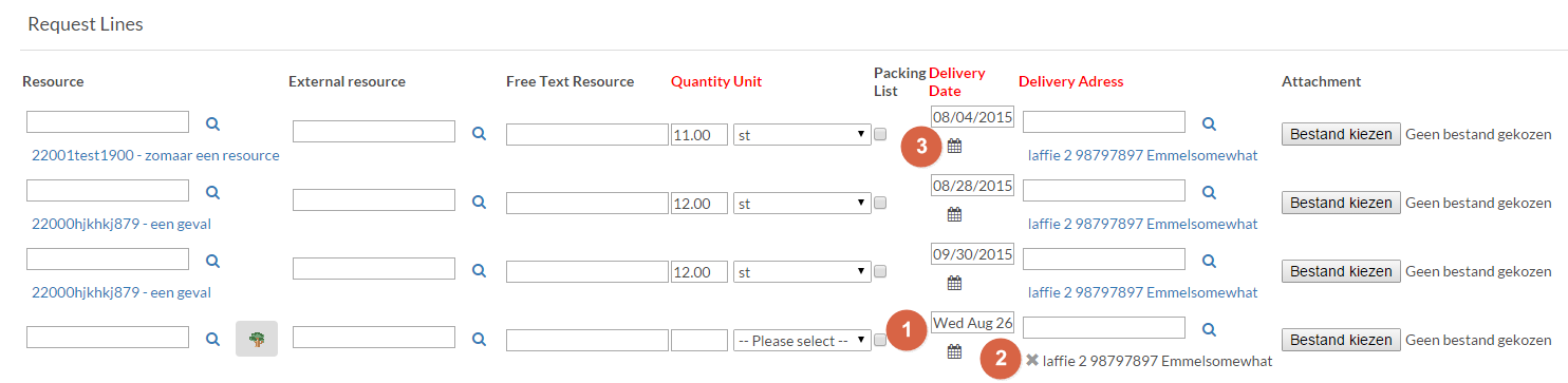
Last a line is newly added:
1) Date is displayed different when it is picked from the calendar.
2) Only newly added related items can be removed by the x in the label, also the labels have different colors. The labels are also not displayed in the field, but in the "old" fashion way.
3) The calander icon is displayed below the field.
(we also created a case for this: 00323063)